Design of the Week: Michigan vs. Ohio, The Rivalry Continues
The craft beer movement has hit almost every town across America by now (unless you live in Texarkana). Maybe even more important than taste, craft beer relies on branding. We here at Two Dollar Radio draw a lot of inspiration from kick-ass label artwork. Being a consumer, I'll drink a shitty beer if it looks cool enough.
Because this is America and we make everything a competition, and because we live in Ohio where a good-spirited (because Ohio always wins) rivalry with our neighbors to the north is ingrained in our blood, I thought we could compare craft beer bottles/cans from Ohio and Michigan. We all get along, don't we?
ROUND ONEHoof Hearted (Columbus, OH) vs. Shorts (Bellaire, MI)
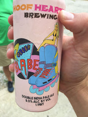
These breweries both seem to be going for the "goofy" image with ridiculous beer names like Soft Parade and Wangbar, and illustrations. With the hand-drawn font, better color palette, and generally much more creative thought, it seems like whatever they are going for, Hoof Hearted is coming out on top with some nifty artwork (no matter how immature at times).
Shorts Brewing (MI)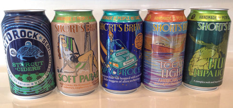
Great Lakes (Cleveland, OH) vs. Bell's (Kalamazoo, MI)
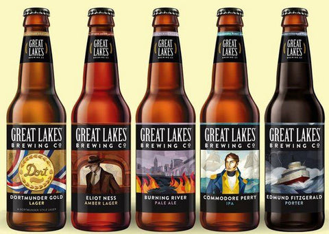
The battle of the giants of Midwest craft beer. If you drink beer in the Midwest, you've probably heard of and/or seen these bottles. Both of these guys have been doing the craft beer thing for a while so we must pay homage to them like we would a punk band who paved the way for more punk bands (whether for the best or otherwise). Both seem slightly out-date with their bottle design and haven't caught wind of the can movement. Bell's offers more stylistic variety, but Great Lakes underwent an impressive re-branding this spring and is looking pretty sharp and uniform with the flattened artwork. (Not pictured below are the Great Lakes imperial IPAs, which are possibly the sharpest: Chillwave and the Lake Erie Monster.)
Bells Brewing (MI)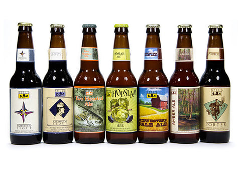
Jackie O's (Athens, OH) vs. Founders (Grand Rapids, MI)
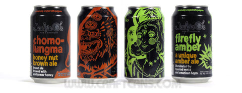
Founders brews some of the best beer around (no doubt), but Jackie O's is doing their thing, too. Founder's is hung up on the bottle game (like most of Michigan), except for their All Day IPA which is delicious IMO. Jackie O's stole the hearts of OU grads in Athens, OH and puts out some beautiful cans featuring illustrations of reindeer, whatever that monster is on the Chomolungma can, and the Mystic Mama mama. They look like tattoos and remind us of Ricardo Cavolo's work. The black can with the different color illustration is effective and strong branding. The Founders logo looks like a restaurant you'd find across the street from Applebee's.
Founders Brewing (MI)
Beer is dope and should look cool, too.


Comments